
 Due to the nice weather this weekend, I decided to feature a picture of the same sailing ship from one of my previous posts. It’s on a day like this I can imagine being outside, enjoying the water and the views. The picture on the right perfectly illustrates this. This is the type of photo that would be great in a living or dining room. The neutral colors of the ship go perfectly with any decor, and the scale of the background creates a grandiose feel to the space. No tall sailing ships in your local marina? Any ship, sail or no sail, can still work in your space. As long as you’re able to capture the feel of a summer day on the water, you’ve got the perfect shot.
Category Archives: design
Spring has Sprung: Part 3
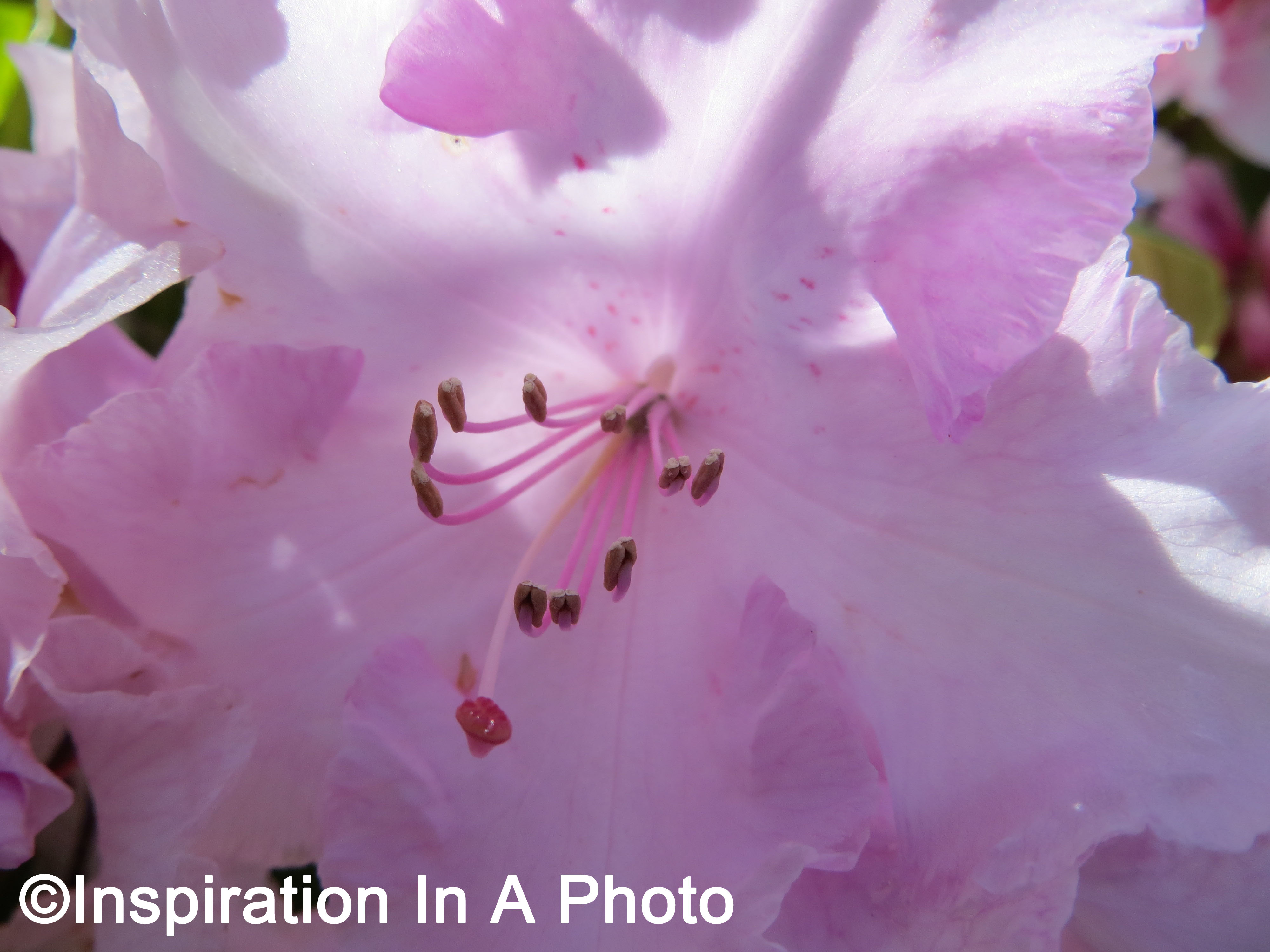 This final post in my series features a close-up of the same type of flower in my previous two posts. The combination of light and shadow, along with a close-up of the flower’s internal workings, makes this a great photo for any space. You can take a similar picture by getting your lens as close to the middle of your favorite flower as possible. Once you’ve taken that perfect shot, I’d suggest enlarging the photo and using it as a focal point on a living or dining room wall. The flower, no matter the shade, will bring a bit of color into any room. In addition, a large photo is one of the easiest and most economical way to add new life to a stale room. I hope you’ve enjoyed this three-series post featuring bright, beautiful flowers, and that I’ve inspired you to brighten up your decor.
Spring has Sprung: Part 2
 On my second post in this series, I’ll be concentrating on a group of yellow flowers. While the flowers themselves are the same variety as the ones in my previous post, their color variation provides a striking difference. While both colors can be considered warm, the yellow variety are slightly different in appearance. There’s less of a ombre effect, and some segments of the petals have a dotted pattern. Besides the contrast of light and shadow in this picture, the leafy green background makes the flowers pop. This is a great example of how you can find multiple shades in the same color family to use in your decor. Not sure what shades to use? Try using a combination of similar photos grouped together on a wall, or use them throughout several rooms. Stay tuned for more posts in this series, coming soon!
Spring has Sprung: Part 1
 It’s that time of year when it starts to get sunny and the flowers start to bloom: Spring! I’m starting off this series of posts by showcasing a few orange flowers. There aren’t many flowers in nature that are orange, so when I saw these I just had to snap a picture! I love how each flower has a slightly different shade, including the ombre effect that occurs as you go from the middle of the flower to the outer petals. Being able to capture the uniqueness of nature is one of the best parts of this time of year. No matter what color scheme you have, you can find something in nature that will let you welcome Spring into your space!
The Forest in the Tree
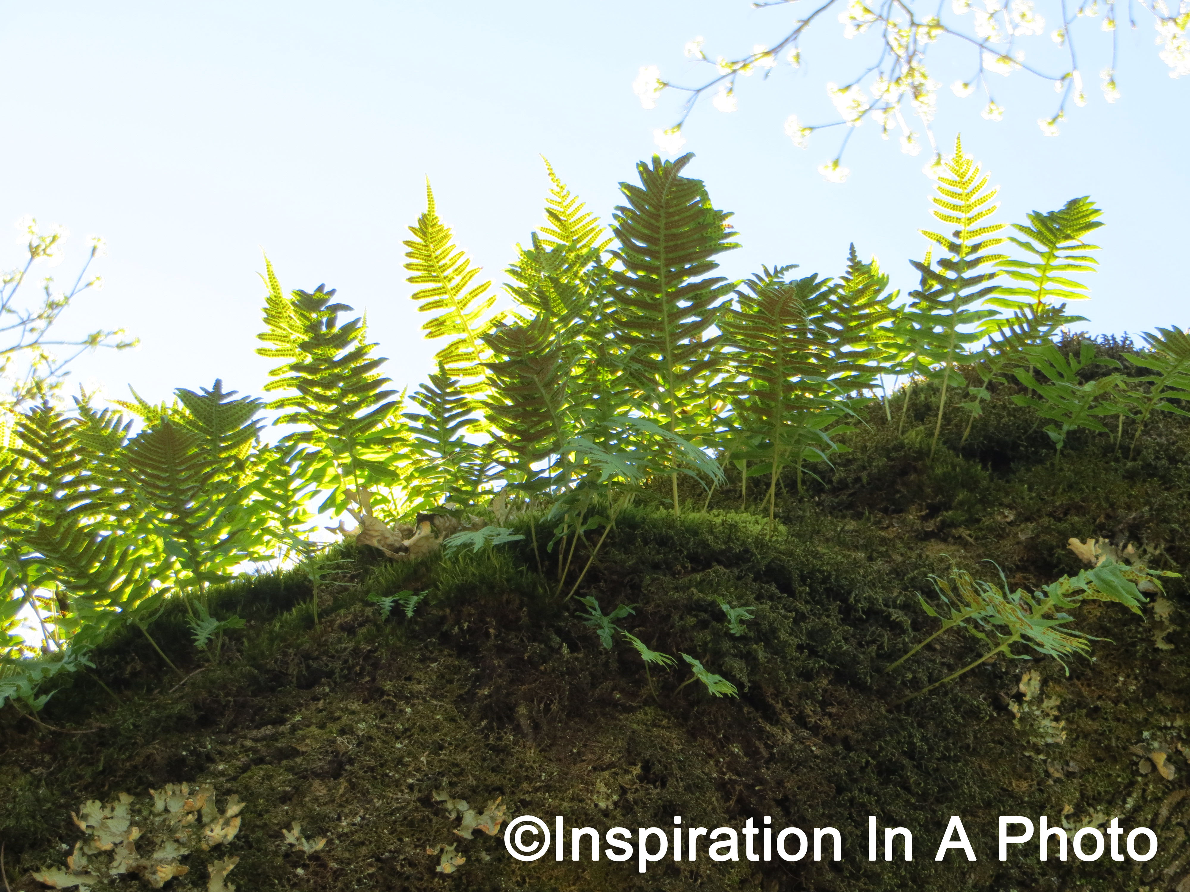 One sunny day I was walking underneath a large, old tree and noticed something interesting on one of the branches. As seen on the right, it looks like a mini forest! The combination of the bright green fern with sun streaming through its leaves, the mountainous landscape of the branch, and white flowers in the background make this an awesome shot. You can shoot a similar picture by checking out your local old growth trees. They may be hard to find depending on where you live, but if you explore a state park or area that features historic buildings, you’ll have a better chance of finding what you want. Now is the perfect time to snap pictures you can use to update your space. Whether hung on a wall or simply used for inspiration, you can snap a beautiful picture to usher in Spring!
Classic Blue and White: Inspiration from Nature
 As I’ve stated in previous posts, you can find lots of inspiration from nature and what’s around you. An example is the classic blue and white color palette. The inspiration? The sky! This color combination provides just the right amount of brightness, while also being able to blend into one’s current decor. In addition, there are so many different shades of blue, that you’re sure to find one that’s a perfect fit for your space. You can go all out and have an entire room in blue and white, or you can add just a few accessories. Take a picture of the sky and hang it prominently on a wall, create a cluster of blue and white vases, add throw pillows, or add a new rug to a room. No matter how much blue and white you decide to use, you’re sure to create a bright and airy feel in your space!
Picture a Pattern: Part 6
 Welcome to my final post on patterns! I’ll be finishing off this series of posts by featuring another piece of clothing. This one is a formal top with a black and white floral pattern. This would be the perfect addition to a monochromatic space that could use a pop of pattern. Framing a similar print creates a visual interest and draws the eye upwards, allowing your visitors to take in the entirety of your beautiful space. In addition, this also saves money since you’re using patterns you already have in your closet. It’s great when your decor can do double duty, and even better when you can throw clothing into the mix! I hope you’ve enjoyed my series on framing patterns, and have found lots of inspiration for your own space!
Picture a Pattern: Part 4
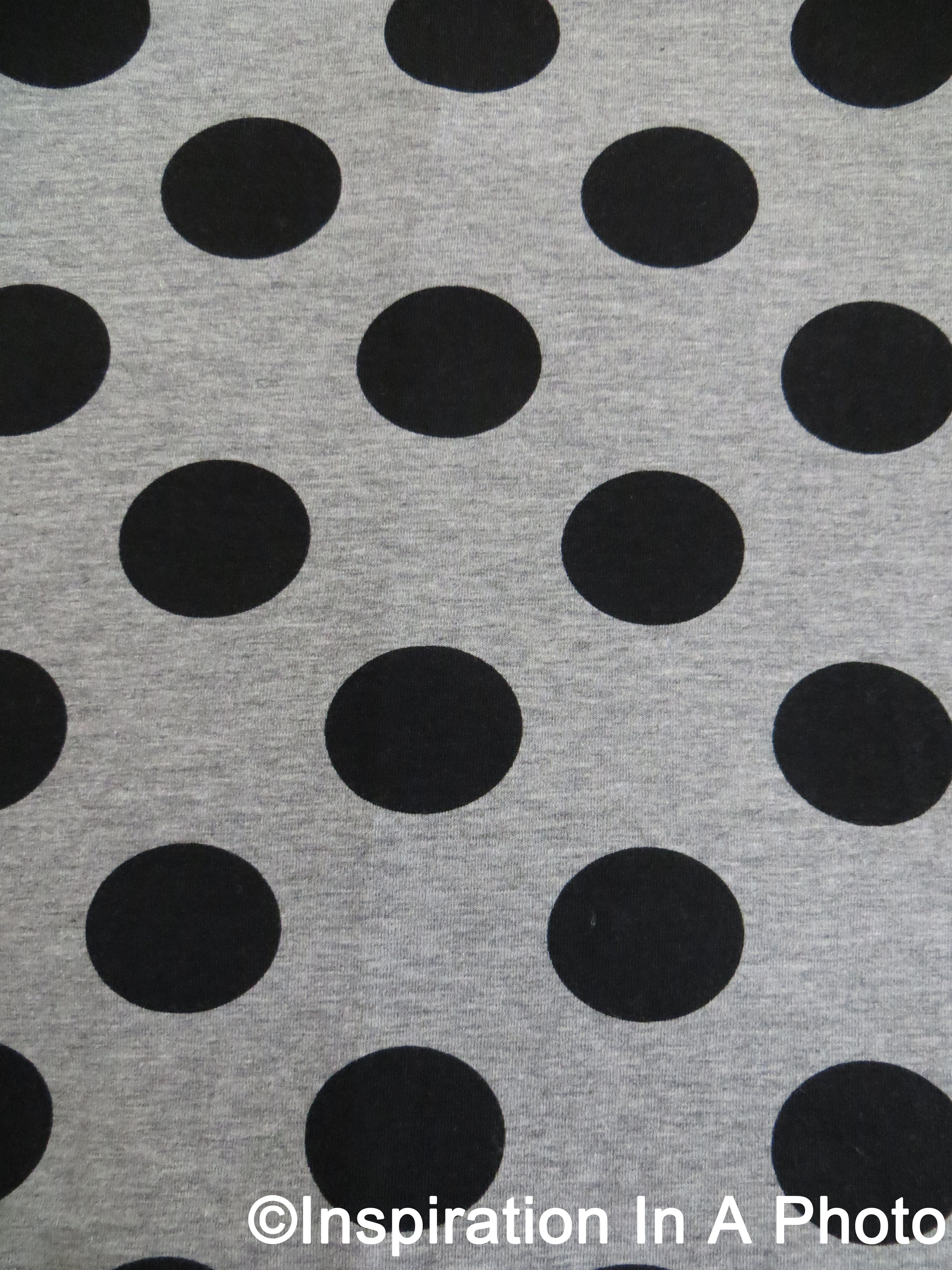 For the fourth post in this series, I’ll once again be focusing on a pattern from one of my dresses. This one is a simple polka dot a pattern in black and gray. This pattern can easily go with any decor, and would be the perfect addition to frame and put on your wall. Looking for a way to tie a pattern into the rest of your room? Buy a similar fabric and create covers for your pillows. Doing this is an easy and inexpensive way to create a cohesive look for any room. With a little imagination, even the simplest of patterns can create a new look for an old space!
Picture a Pattern: Part 1
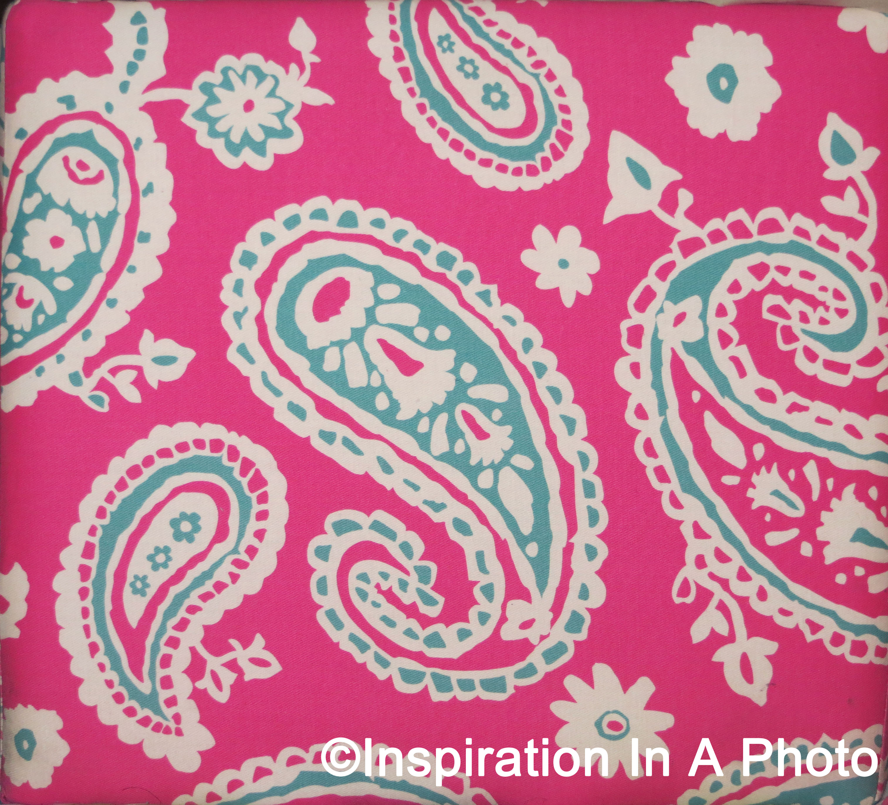 Hello! In this new series of posts, I’ll be featuring a number of patterns that are great for decorating. I’ll start by showcasing a pink paisley pattern (right) from an ottoman located in a bedroom. While the ottoman itself brings a great pop of color, I wanted another way to tie it into the overall decor. My solution? Frame a picture of the pattern! This allows me to better tie in the pattern to the rest of my decor. You can do the same thing with your own ottoman, or use a pattern from a favorite rug, comforter, or pillow. Stay tuned for more ideas on framing patterns to add a unique touch to your space!
The Creek that Never Was
 Staring out the window you can’t help but notice the mature trees and what looks like a small, dried up creek. It reality, this meandering indentation is a trench for an underground pipe. After installation, the trench was never filled in. As a result, I’m left with a beautiful picture of a faux creek meandering through trees! A similar picture is a great way to bring the outdoors into any room. As I’ve said in previous posts, optical illusions can provide great photographs and fun stories. No matter where you are, you’re sure to find an optical illusion that will be the perfect addition to your space!
